


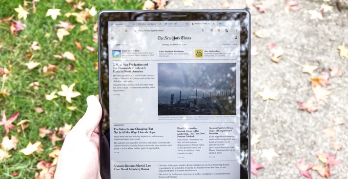
Viewing the full web is one of the great parts of using a Chromebook, but sometimes the full web doesn’t feel quite so full – especially if you’re exploring it with a touchscreen. Much of the internet remains poorly-optimized for touch, and desktop websites are still, first and foremost, designed for point-and-click experiences. With the launch of the Pixel Slate, Google’s senior product manager for Chrome OS, Kan Liu, confirmed to me in an interview that the company is aware that not all websites are going to be a great fit for a touchscreen. To address that, an upcoming release of Chrome OS for tablets and touch-enabled Chromebooks will add the option to render the mobile version of a webpage.
In the upcoming release, we are also introducing “Request tablet site” in Chrome on Pixel Slate, and with more and more touchscreen devices out there we fully expect the web to continue evolving to be more touch-friendly as well.
While it does essentially confirm that a Chrome tablet may not always be the best way to browse the web, it’s good that Google is acknowledging that’s the case instead of simply making users put up with it. After all, some desktop websites just don’t cooperate with touch input, with wildly out of control scrolling, impossible to hit touch targets, and unpredictable scaling. With this new toggle, you’ll basically be telling that website you’re an iPad – which could make things a lot easier to stomach (and, potentially, improve performance).
Liu didn’t confirm which “upcoming release” he was referring to, but I have to expect this is a sooner-rather-than-later kind of feature, as Google is rushing to polish up the experience on its new Pixel Slate tablet – likely one of the first devices that will be getting this new toggle. And the one that probably needs it the most.


