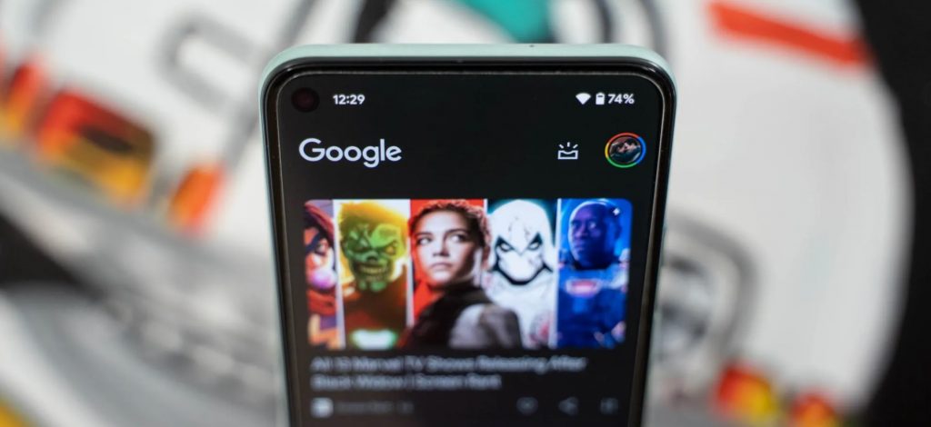
In June, Google redesigned Discover to be “more streamlined” by removing article descriptions and making other visual tweaks. On Android 12, the Google Discover feed to the left of the Pixel Launcher has added more Material You flourishes.
On Android 12, Discover features a custom header where the Google logo is left-aligned — instead of centered, while the profile avatar is much larger and the shortcut to launch Assistant Snapshot is next to it.
With the latest Google app beta (12.32), Google is adding some Material You flourishes. Since the broader redesign, the feed of articles has never extended to the top of the screen. Rather, it stops a good sixth of the way down the screen. The rounded corners are now visible and highlighted by a themed header space.
It takes advantage of Material You Dynamic Color to show a background color, while the Google logo makes use of a darker shade. In the examples you see below, it’s much more interesting than having a single bright color for the entire screen’s background.


Meanwhile, on dark themes, a pure black background that contrasts with gray cards is used. Google does, however, subtly tint its logo and the Snapshot icon.
This change is currently in the beta channel and demonstrates how wallpaper-based Dynamic Color is bleeding into more apps, though the Pixel Launcher Discover feed is mixed in with the system UI, thus joining Quick Settings as another high-profile place users will see Material You in action.


