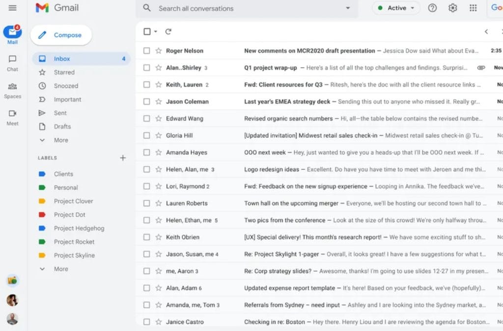
Google has announced that Gmail’s new layout, which changes how Google Chat, Meet, and Spaces are integrated, will be available to try starting in February; become default by April; and become the only option by the end of Q2 2022. The view makes it so Google’s other messaging tools, which are part of (but not necessarily limited to) its business-focused Workspace suite, are no longer just little windows floating alongside your emails, but get their own screens in Gmail that are accessible with large buttons on the left-hand side.
Google calls this the integrated view, and it’ll soon be familiar if you (or your employer) are a Workspace customer. Starting February 8th, Google says you’ll be able to start testing the layout for yourself. By April, anyone who hasn’t opted in (Google shows that there’ll be a prompt at some point, encouraging you to do so), will be switched over to the new layout, but will be able to switch back in settings. That option will go away by the end of the second quarter, according to Google, when the new layout becomes the “standard experience for Gmail.”
The new view could be polarizing — while managing chats and meetings can be a bit confusing in the current Gmail layout, it all happens on one screen, which is pleasing if you love data density. But for those looking to focus on one thing at a time, the new interface looks like it’ll give you easy access to other tools without having them always on the screen, based on what Google’s shown off so far.
The company says that there will also be notification bubbles to let you know if other tools need your attention, which could be less distracting than, say, having a list of all your Chats living to the left or right of your emails.


