Apple features a redesigned Safari with macOS Monterey but as it happens, the biggest UI change isn’t seen with the default version. Let’s jump into what’s changed, what’s new, and how Safari in macOS Monterey looks and works.
Apple made its way through a lot of Safari iterations during the macOS Monterey beta period and it even changed from the 12.0 build that comes installed on the 2021 MacBook Pro to the official Monterey public 12.0.1 release.
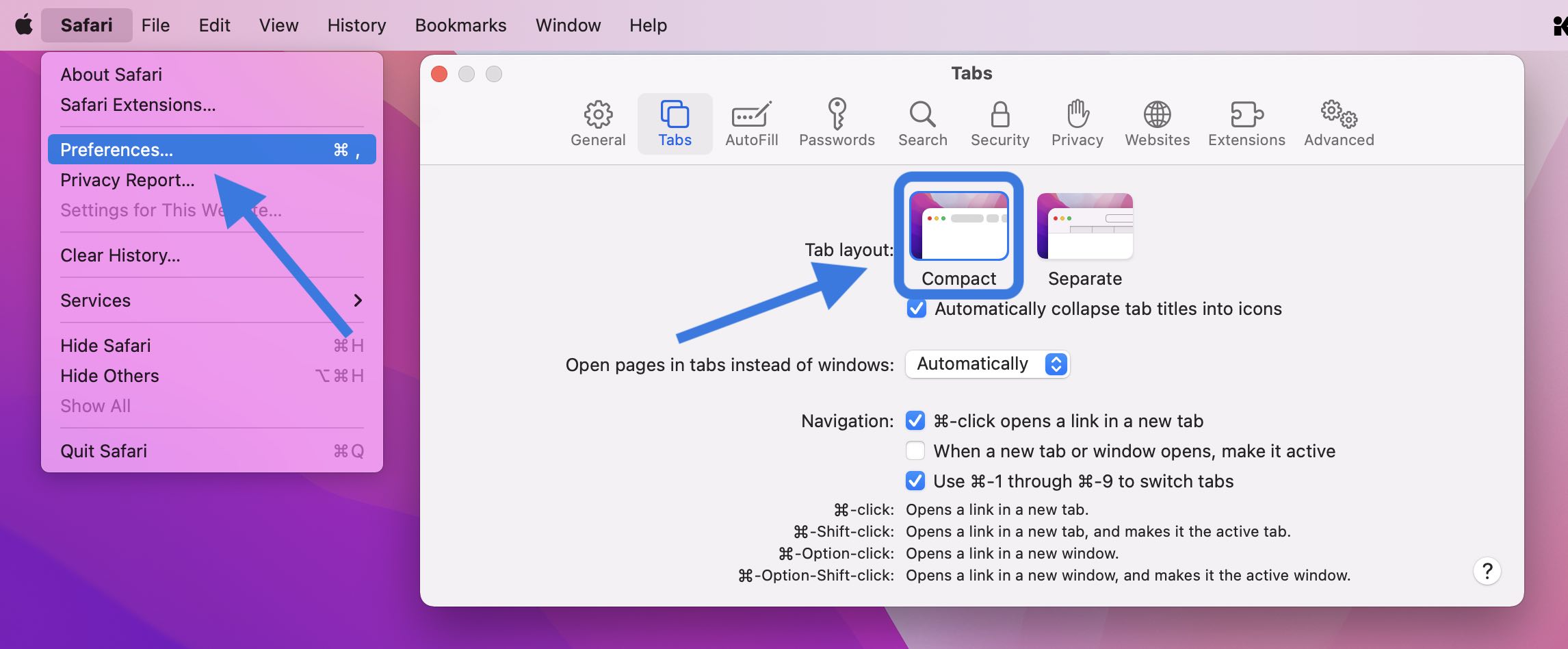
While the default Safari experience on Monterey 12.0.1 and later looks very much like what came with Big Sur, you can opt for the new modern and minimal new tab design by heading to Safari > Preferences > Tabs > Compact.
Beyond the default classic and optional super modern UI, Safari in Monterey includes new tab groups, a redesigned sidebar, the new Quick Note feature, UI/button changes, and more.
Safari in macOS Monterey: What’s new and how it works
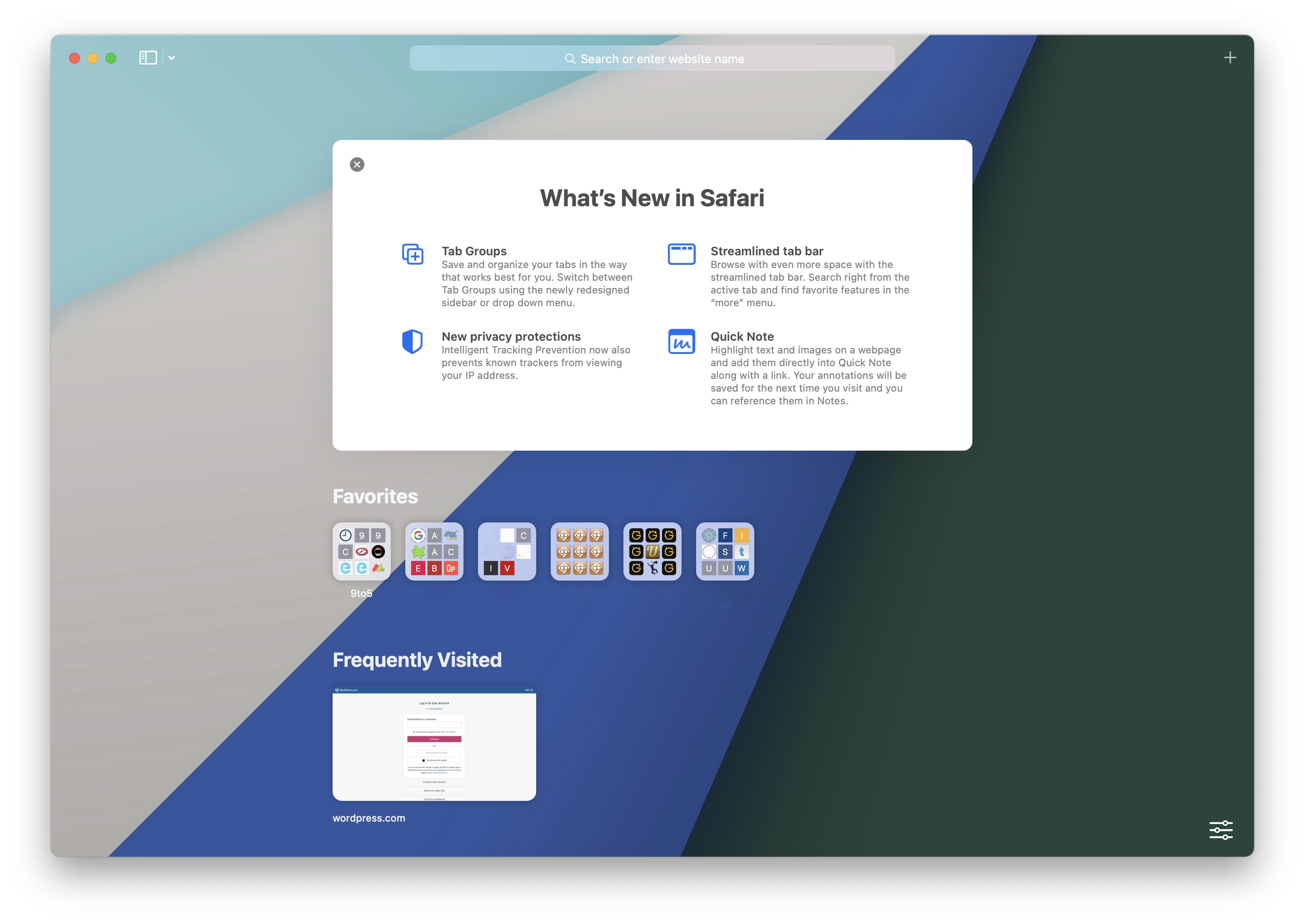
Start page
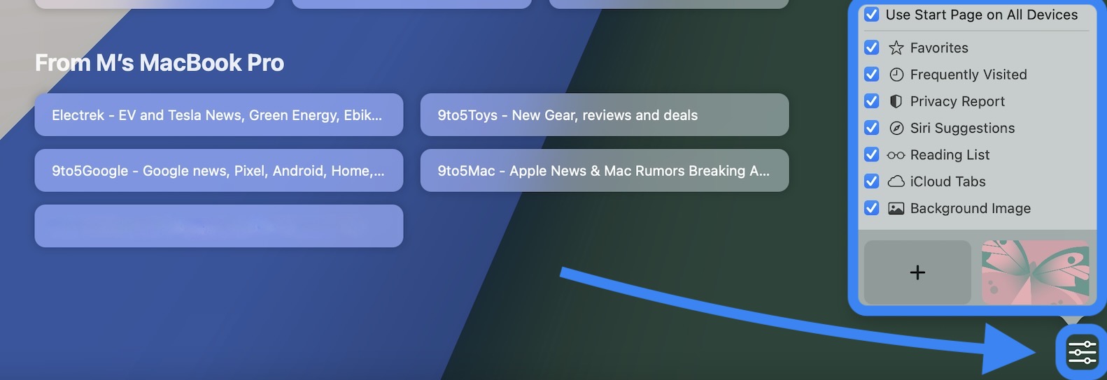
The start page in the new Safari looks about the same with your Favorites up top, followed by Frequently Visited, Privacy Report, and Reading List. Like Safari in Big Sur, you can customize your start page background image with the included options or your own. You can drag to reorder the different sections or turn them on/off.
New in Safari for macOS Monterey/iOS 15 is that background images automatically sync across devices via iCloud. You’ve also got the new “Use Start Page on All Devices” option and a checkbox to turn on/off iCloud Tabs for the start page.
You can head to the bottom right corner 3-line icon to customize your start page, including the background image.
Safari’s new unified tab/search/toolbar
Just like Safari in Big Sur, you can right-click at the top to customize the new unified tab/search/toolbar with more buttons (or in the menu bar, click View > Customize Toolbar).
By default, the toolbar includes five buttons: Sidebar/Tab Groups, back/forward, downloads, share button, and new tab + icon.
Here’s a look at how it comes and what’s available when you customize:

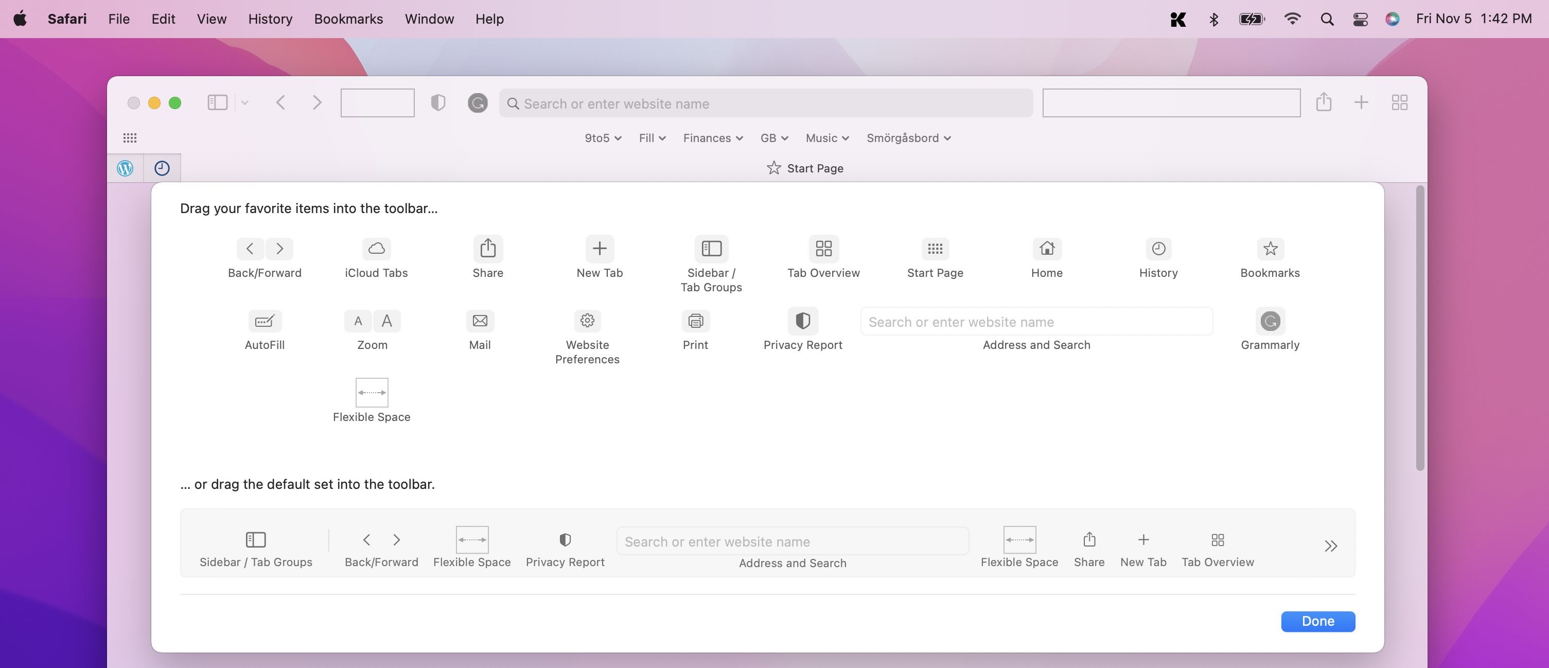
If you choose to stick with the default Safari in Monterey, you’re getting the same tab UI experience you’re used to with macOS Big Sur and earlier.
But for the new modern UI, it’s quite an aesthetic change. Head to Safari > Preferences > Tabs > Compact to use the new design:
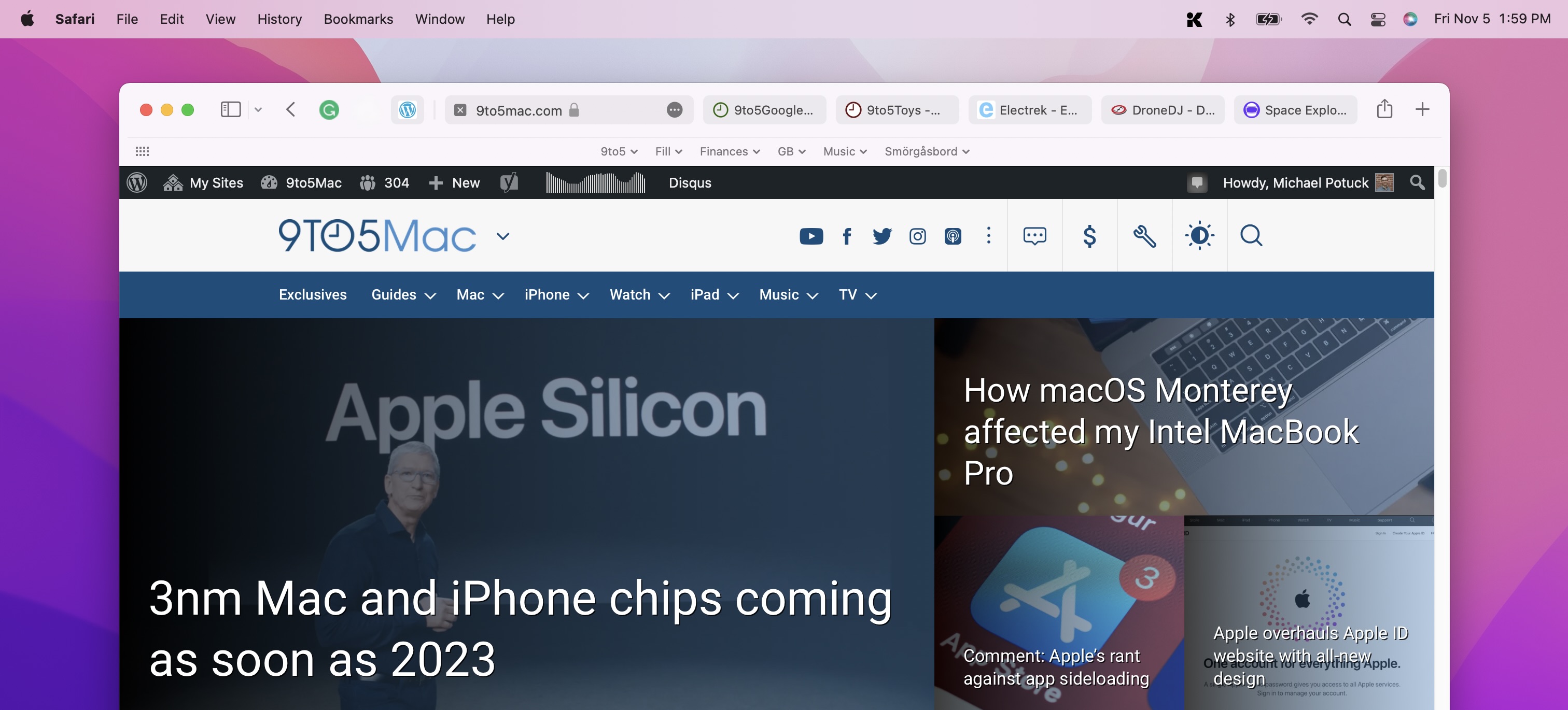
This is how the modern, “Compact” tab design looks:
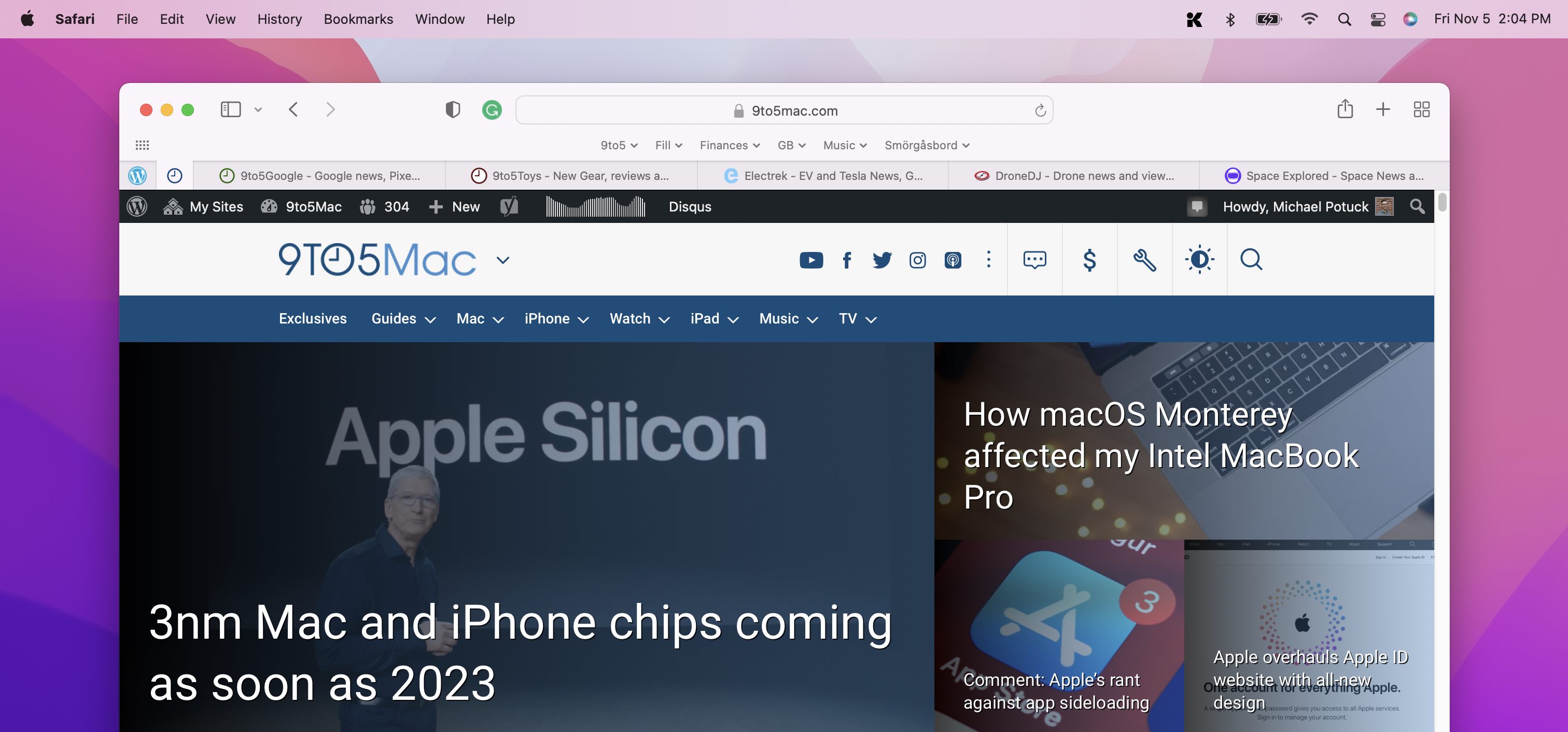
And here’s the default/traditional UI, what Apple calls “Separate” tabs:
Using tabs and tab groups in the new Safari
You can drag tabs or the URL/search bar to the left to pin a tab/open page. However, the mechanics can feel a little clunky in the modern Compact UI. For example, reordering pinned tabs requires some precision and patience.
With the new Sidebar/Tab Groups button (in either the Separate or Compact UI), click the dropdown arrow to pull up saved Tab Groups or create new ones:
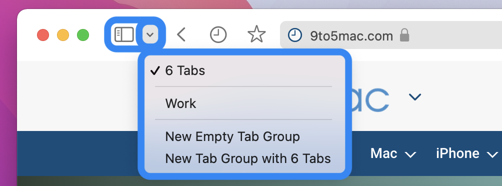
You can create a new empty tab group or quickly make a new Tab Group your existing open tabs.
As you’ve already guessed, you can make multiple tab groups to quickly switch between different sets of saved web pages to work and play more seamlessly.
Just click the Tab Groups drop-down arrow anytime to get back to your saved groups. And alternatively, you can click the Sidebar button to see your Tab Groups.
Finally, you can click the Tab Overview button (four squares icon) to see all open tabs.
Refreshed Sidebar
For the new Sidebar, you’ll see “Start Page” up top with your Tab Groups below.
Under that, you’ll see links that have been shared by others, then Bookmarks and your Reading List at the bottom.
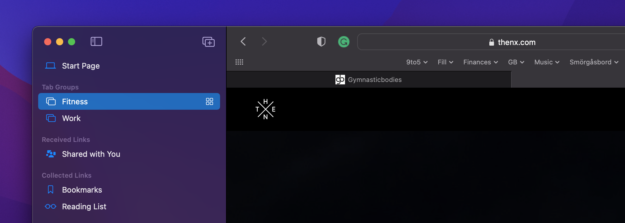
When the Sidebar is enabled, you’ll also have the two-window + icon show up to quickly create a new empty tab group.
Creating Quick Notes
Quick Notes are new for macOS Monterey and iPadOS 15. There are a couple of ways to use the feature with the new Safari.
You can click the three-dot icon in the URL/search bar > Add to Quick Note with the Compact UI.

With the Separate tabs UI, you can click the share button (square with up arrow > Add to Quick Note).

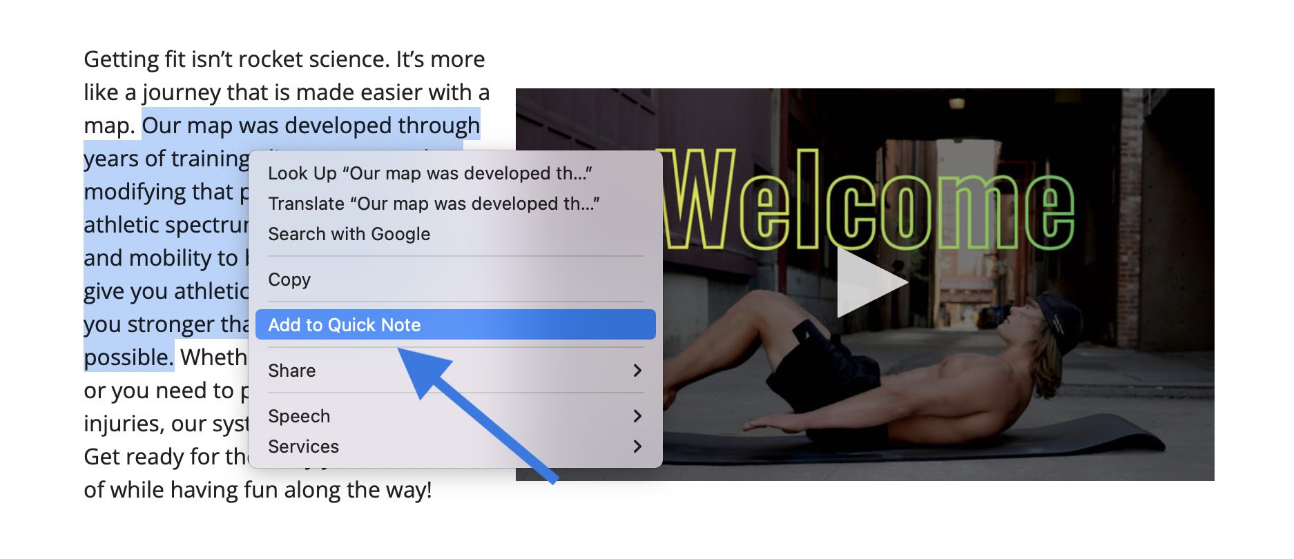
Or, when you highlight text on a webpage and do a right-click, you can choose Add to Quick Note.
Safari in macOS Monterey wrap-up
After a lot of changes for Safari throughout the Monterey beta, Apple seems to have landed on a build that satisfies people who want the classic browsing experience and tab design as well as including an all-new UI for those ready to change things up.
What do you think of the new Safari in macOS Monterey? Are you using the new tab UI or the default? Share your thoughts in the comments below!
