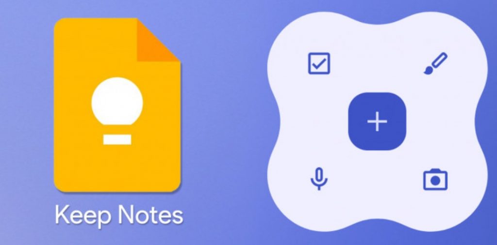
Google Keep is one of the most useful apps in Google’s ecosystem. I personally use it a lot, since the ability to take quick notes on your phone and accessing them from any device is really convenient. And now, it’s getting even better, since it’s joining the list of apps that will be using Material You. Ahead of the final release of Android 12, which is due soon, Google has worked on updates to most of its apps to make them adhere to Material You and its UI changes, as well as its headline dynamic theming feature, and Google Keep is joining this list.
The changes are immediately clear when you put them side-by-side with the current version. The search bar is now pill-shaped, the floating action button is now a rounded square, and most importantly, colors will change with your wallpaper’s color palette. This is the standard treatment other apps with Material You redesigns have received so far. The new version of Google Keep seemingly won’t be any different functionally, with a lighter makeover compared to other more radical redesigns we’ve seen.

The new version of Keep appears to be rolling out widely at this point — you can see the new interface with the rounded + button on Android 11 if you install the latest version. If you’re on Android 12, you might also get access to some sweet new Material You widget designs:
Unfortunately the new widgets appear to be rolling out in stages (sigh). We’ve seen some users with 5.21.361.07.40 get them and others with the same version keep the old widget designs. The new version of Keep is now in the Play Store, but you can grab it on APK Mirror if you’re not seeing it yet.


