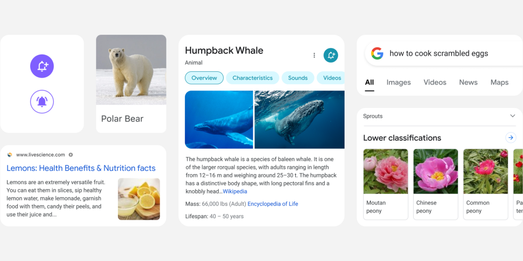
As the company’s flagship product, major changes to Google Search take some time to develop and are heavily tested. Google today announced a significant redesign of how Search looks on mobile that is focused on simplicity.
It starts at the top of the screen where the search field is now visually elevated from the company logo, profile avatar, and other elements. This added depth replaces how the bar previously used faint gray outlines. The search filters that appear underneath are no longer uppercased, while the current category in view is just marked by a narrow black, instead of blue, underline.
Knowledge Panels are currently distinguished by a large header that includes the name, category, and carousel, while the background is lightly themed. The new design drops this separate top section and makes it one with the information and image gallery — which now features rounded corners — displayed below.
One aspect of this redesign sees colors used “more intentionally to guide the eye to important information without being overwhelming or distracting.” For example, it gives emphasis to the subtopics carousel, which now displays each section in individual chips. A spectrum of hues — muted to bold — were explored for this redesign, but Google opted for a solid background to keep the focus on content.
Mobile Google Search redesign
Further down the page, web results now span from the left-to-right edge. While still housed in cards, the effect is much less apparent with Google moving away from shadows. Overall, this helps provide more space for content and results in a cleaner look that’s less busy.
Another change sees the Google Sans font used in more places at a larger scale and bolder weight. Text in the company’s exclusive font is easier to read on white backgrounds and much bigger in places, like for Knowledge Graphs. This helps users quickly scan results.
“We want to let the search results shine, allowing people to focus on the information instead of the design elements around it.”
The goal of this revamp on phones and other mobile devices is to make it easier to search by having everything else recede. It’s rolling out to the mobile web, as well as the Android and iOS Google apps, starting today and will be widely available over the coming days. Desktop Search already has a similar redesign but only for certain types of queries, like those related to COVID-19.


