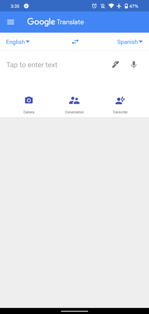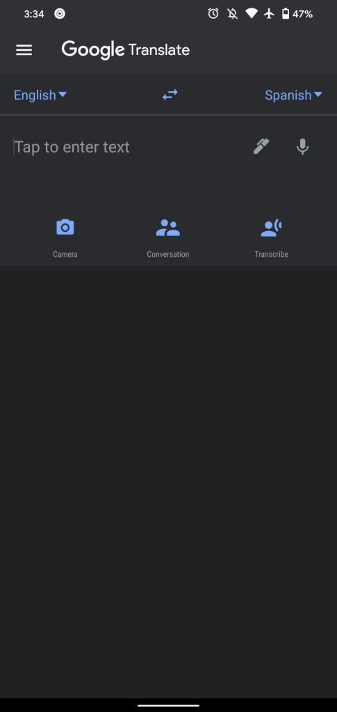
Back in February, some Google Translate users on Android received a dark theme. That look never widely rolled out, but a new, modified version is now available.
Compared to the version that rolled out with version 6.5, the new Google Translate dark theme drops the light blue app bar for a more uniform gray. That touch of color was particularly jarring for a text-heavy application. This brings consistency to the Translate interface and matches all other Google applications.
This is a pretty straightforward dark mode implementation. Translate for Android is otherwise unchanged and still sports a navigation drawer where the current section you’re viewing features a faint outline. A Material Theme design would remove that side menu for a bottom bar, which is already available on iOS.
There is no way to turn off the dark theme inside the app. Rather, you have to use Android 10 and 11’s system-level toggle, which is a bit odd.
As of version 6.10 this afternoon, the Google Translate dark theme is widely available.


