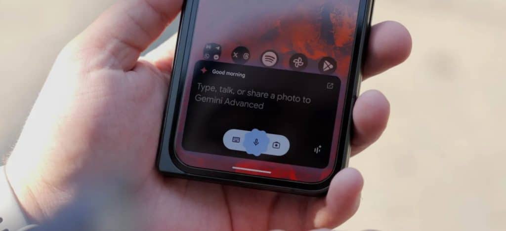
Following the web, Google is giving the Gemini app on Android a greatly simplified homescreen.
Previously, you had the “Gemini Advanced” logo at the top and a carousel of suggestions (which you could hide), as well as the “Chats & Gems” list.
It’s now just a “Hello, [name]” greeting. There’s a new message bubble icon opposite the account switcher to access your Recent conversations and Gems in a design that matches the navigation drawer online.
The chat box at the bottom is unchanged, and is now the only signifier of whether you’re using free Gemini or the paid Advanced variant.
This is a greatly simplified UI that somewhat draws inspiration from the stark and utilitarian nature of the iconic Google Search homepage.
It started appearing on mobile two weeks ago when some people got the updated gemini.google.com homescreen. We’re now seeing this new look on several Android devices today, but not the iPhone, which recently got a homescreen shortcut/widget for Gemini.