![]()

Google has announced a slew of new features for Maps in recent weeks, including Immersive View for routes, more detailed navigation, and transit filters. Google Maps is now rolling out a new color palette.
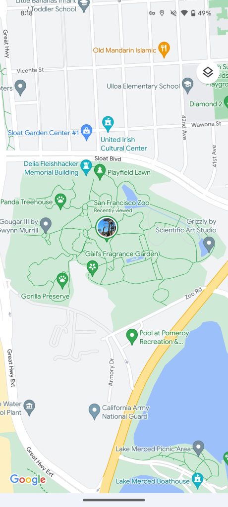
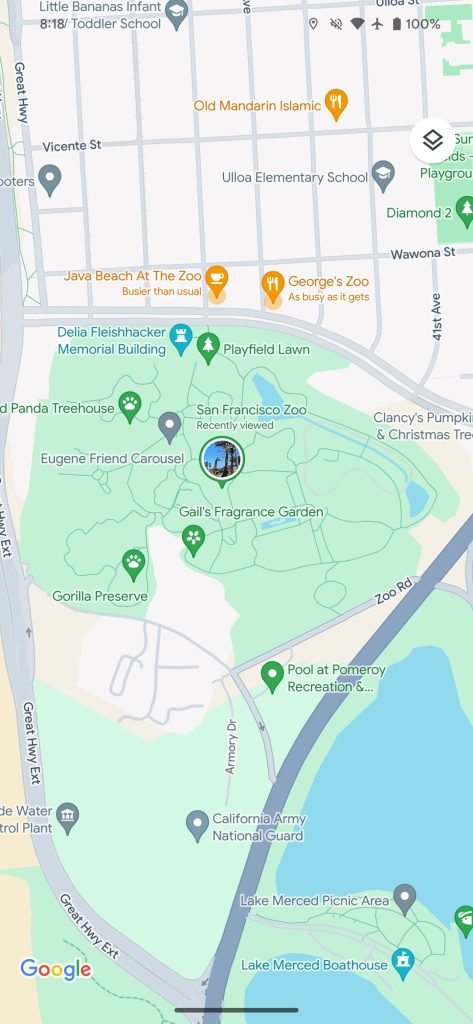
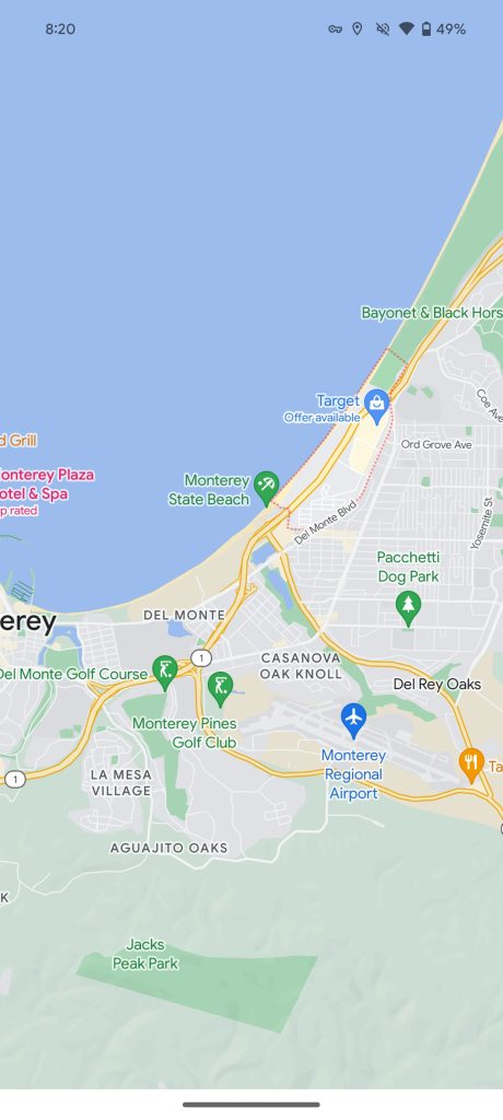
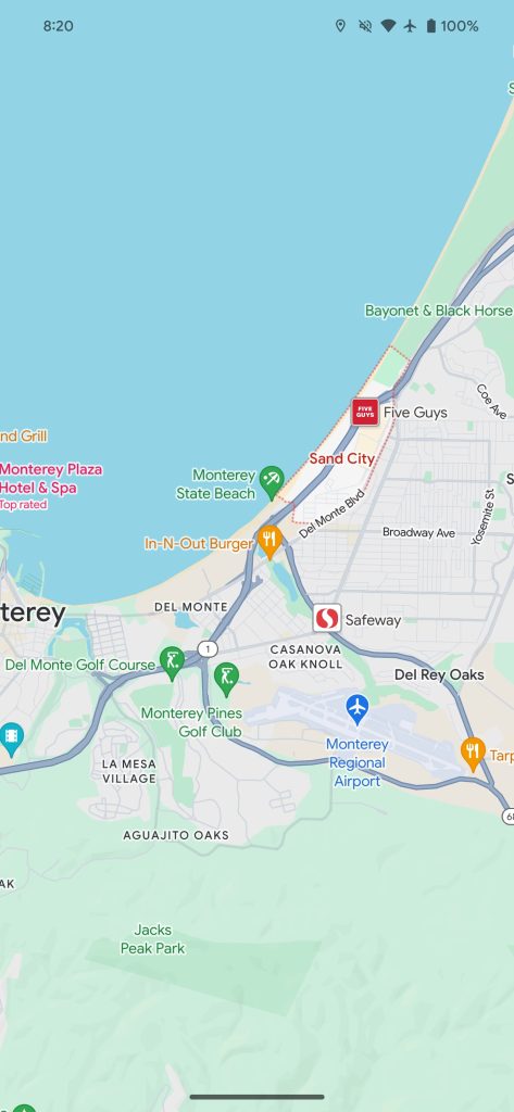
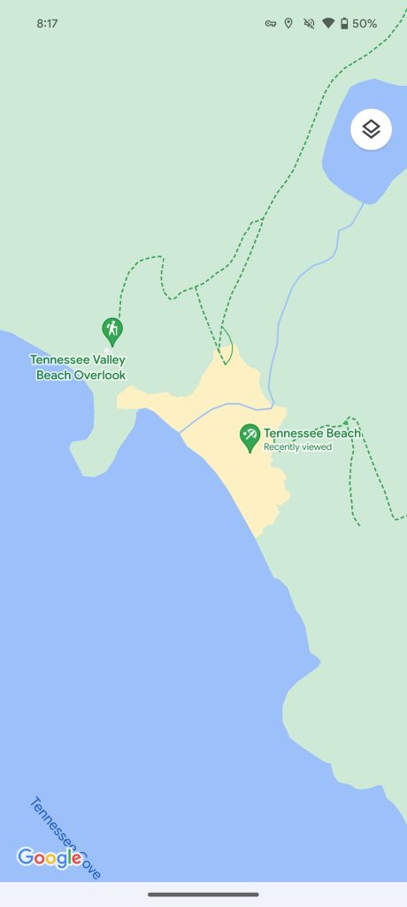
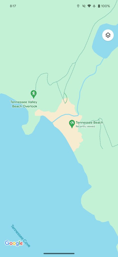
A lighter shade of green is used for parks/nature that results in a nice contrast with roads, which go from off-white to gray. (This allows Google to use white for street crossings, which now appear at more zoomed-out levels.)
Speaking of nature, the dashed trail paths stand out much less with the new color. Buildings and structures are still gray or light yellow, depending on their prominence.
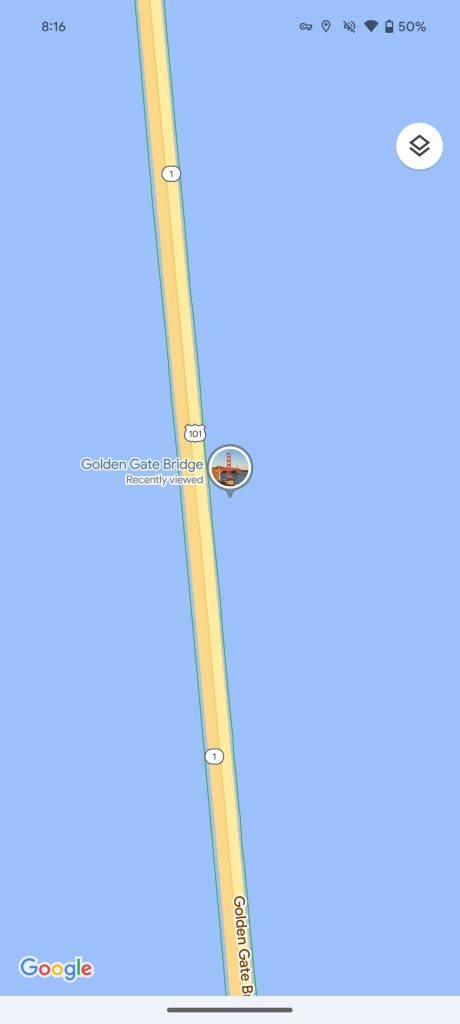
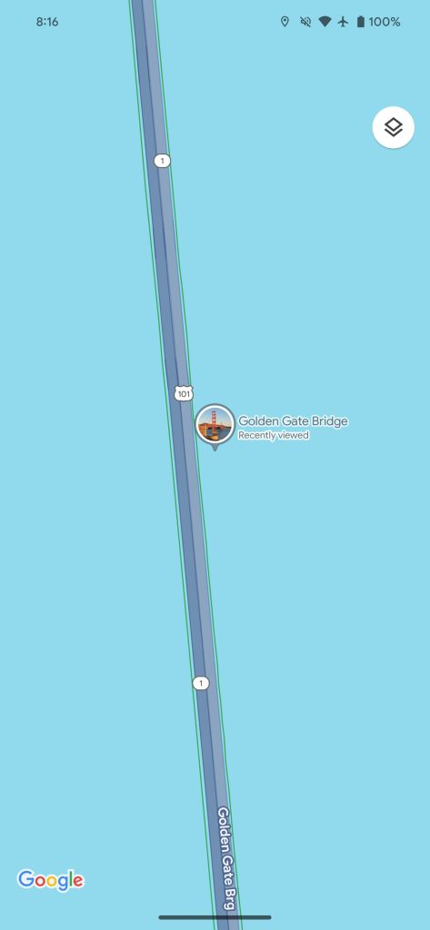
Old vs. new


Freeways are a much darker gray, with some blue undertones, for a nice thematic consistency with roads. It’s a big difference from the tan that we’re familiar with but stands out less against water where a lighter blue is leveraged. Meanwhile, with less yellow, orange pins for restaurants stand out much more.
Overall, the changes are quite noticeable and contribute to Google Maps feeling more lively. There are certainly comparisons to be made with Apple Maps.
Google mentioned that “updated colors throughout the map” were coming back in October, while testing began in August. Some users have had this new palette for several weeks now, but a wider rollout is now underway on Android and iOS. If you don’t have it yet, try force stopping or closing Google Maps from multitasking to get the new colors to load. We’re not yet seeing it on the web.