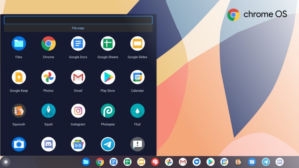
It’s been several years since Google overhauled the app drawer for Chromebooks. It replaced the aging “card” launcher with a touch-focused one, bearing a striking resemblance to Apple’s Launchpad for macOS. While it brought usability improvements to touchscreen Chromebooks, the experience is largely unintuitive with a mouse. Worse, the launcher feels slippery and unpolished, even on a tablet — Google is testing some improvements to fix this. Your mouse woes may soon be over, though, as Google is testing a completely redesigned launcher that’s much more mouse friendly.
Chrome Story recently uncovered a new launcher in development that aims to optimize access to apps, app content, and app actions. If you’re living dangerously on the Canary channel, you can try the new launcher right now by copying and pasting the following URL into Chrome’s address bar:
chrome://flags/#productivity-launcher
To evaluate an enhanced Launcher experience that aims to improve app workflows by optimizing access to apps, app content, and app actions. — Chrome OS
You’ll see a brand new UI after pressing the launcher button on the taskbar.
The new launcher is reminiscent with the “card” design found in older versions of Chrome OS. Its compact design doesn’t obscure the entire screen like the UI used today, instead occupying space on the left side of the screen. The launcher’s 4×5 grid scrolls vertically like the Pixel launcher, and now moves much more smoothly. Tablets will still have the old app drawer even with the flag enabled — which totally makes sense given its touch-centric UI.
The new launcher is reminiscent with the “card” design found in older versions of Chrome OS. Its compact design doesn’t obscure the entire screen like the UI used today, instead occupying space on the left side of the screen. The launcher’s 4×5 grid scrolls vertically like the Pixel launcher, and now moves much more smoothly. Tablets will still have the old app drawer even with the flag enabled — which totally makes sense given its touch-centric UI.