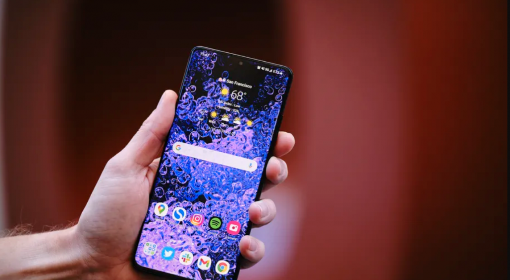
Google’s Messages app is getting a redesign on Samsung’s Galaxy S21 devices, bringing its appearance into line with Samsung’s other One UI software, XDA Developers reports. Screenshots posted by XDA and users on Reddit show the app’s home screen has been divided into two sections: an upper information area with an unread messages counter and a lower section with links to each conversation.
The redesign follows Samsung’s decision to use Google’s messaging app as the default for its S21 lineup in select markets. With the redesign the Messages app now looks like it belongs as a default, with a look that’s similar to other Samsung software like its Notes or Settings apps. However, in the US, Samsung Messages is still the default messaging app.
9to5Google notes that Google has been testing the redesign previously, but that it’s now getting a widespread rollout on S21 devices outside of the US. With the app’s appearance now more in line with Samsung’s design style, it will be interesting to see whether Samsung is tempted to make Google’s app its default within the US.