Forecast for 2025 Was Just Updated, and It May Surprise Retirees")
Back in June, Google thoroughly redesigned Photos with simpler navigation and a long-awaited map view. The revamp was most apparent on phones, but the website also saw some tweaks. Google Photos has now been optimized for Android tablets with an interface that takes better advantage of large screens.
Previously, the tablet UI was just the phone one with a bottom bar that spanned the entire display width even as all three tabs were placed in the center. Few modifications were made to use the extra real estate.
The new optimized interface starts with the top bar adding a search field, though its position depends on how wide your screen is. On smaller to mid-sized ones, it’s at the right next to your profile image and Cast icon, while bigger devices (Chromeboks) have it on the left complete with a hint/prompt and even an “Upload” button that opens the system Files app. This reflects an additional layer of optimization for Chrome OS.
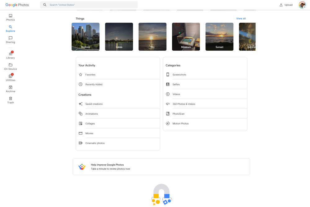
An always-present search bar somewhat obviates the app’s second section, which contains the field on phones. As such, the tablet version of Google Photos renames it from “Search” to “Explore.” Inside, the People, Places, and Things carousels are unchanged.
Speaking of getting around the app, the bottom bar is replaced by a navigation rail on the left edge. After the main “Photos” tab and the aforementioned “Explore,” “Sharing” appears and is no longer located at the top-left corner. There’s a partition in the rail, with “Library” next up.
A big change sees quick access to On Device, Utilities, Archive, and Trash, with each opening as fullscreen pages that don’t show the new sidebar.
This tablet-optimized version of Google Photos for Android looks to still be rolling out with 5.25 (via Reddit) and is not widely available. Meanwhile, the iOS app has yet to be updated.